Vivi
A Wellness App Designed for You
May 2022 – College Project
UX Design, UI Design, Web Design, Wireframing, Design Systems, Branding, Animation, Illustration
The Problem
As my college final project, I wanted to create something that could be useful to the silent demographic of people who are afraid to reach out for help. The purpose for this app was to address the problem of accessible therapy. Alternatively, what to do in between therapy sessions. In this age technology with access to billions of people across the planet, there was a lack of spaces to address mental health in a community. Vivi helps solve the issue of accessibility to a safe space, designed specifically for the user.
The Research
Through conducting competitor research and analysis, I found Headspace and Reddit were the closest to what I wanted Vivi to be. Headspace was also a wellness app that was locked behind paywalls but offered great guided meditation. Reddit can be unreliable and full of distrustful or malicious people but has a good structure to how it handles sub-groups. Taking on the best and removing the worst from these apps I gathered pain points and opportunities to grow Vivi.
Features I wanted to include would be guided meditations, social groups relating to an illness or topic, ways to organize and track meditation playlists, a form upon sign-up that generates content on your feed upon completion.
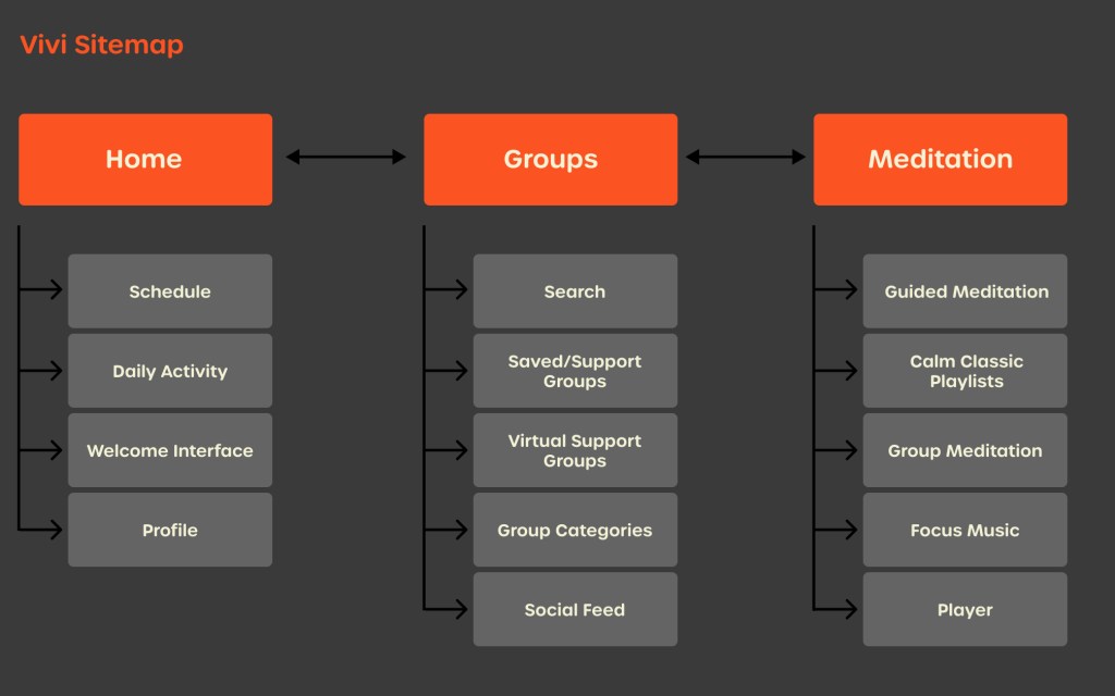
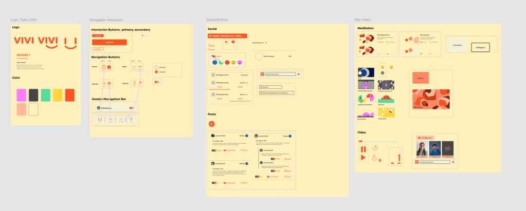
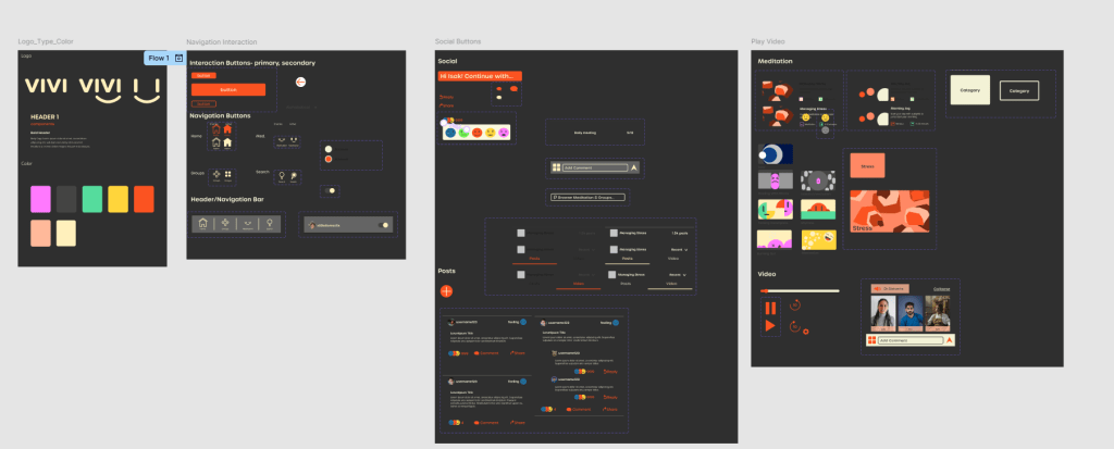
Utilizing Figma pages, I created all of the components and organized them in a design system to pull from and create the final pages. This process was made easier due to my low fidelity wireframes and higher fidelity versions later pulled into Figma below.
Design System Light and Dark mode:
With dark modes trending, I wanted to challenge my organization to create an entire design system and translate it to a dark mode, maintaining accessibility and readability.
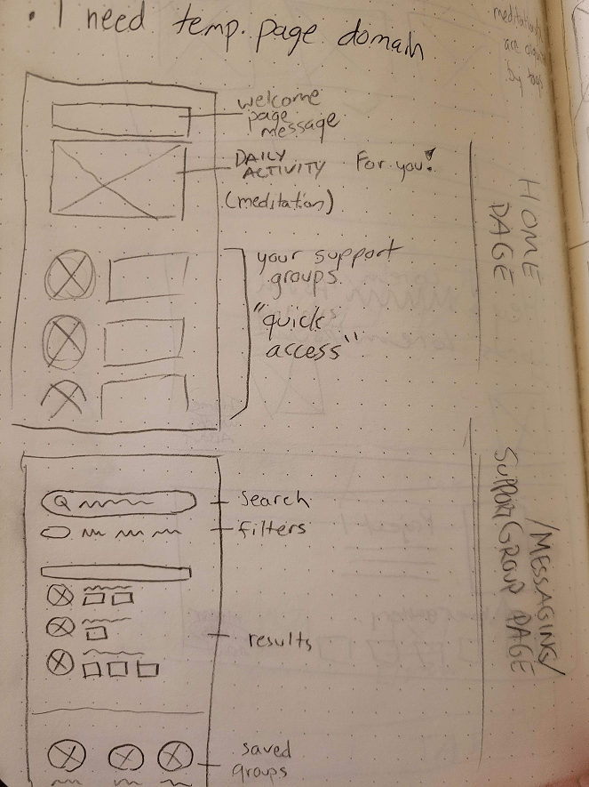
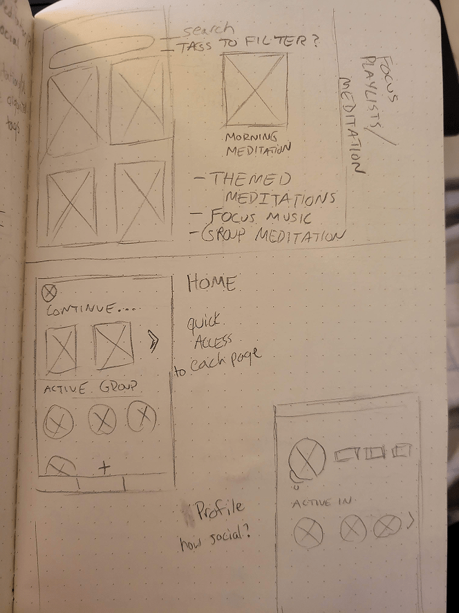
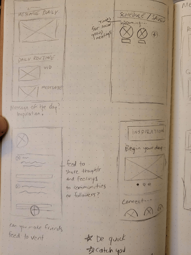
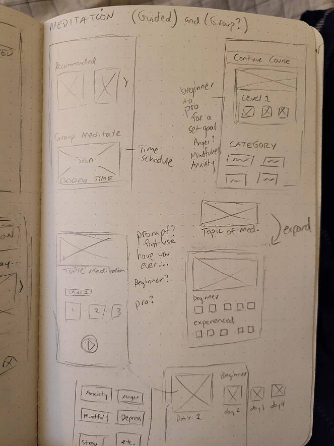
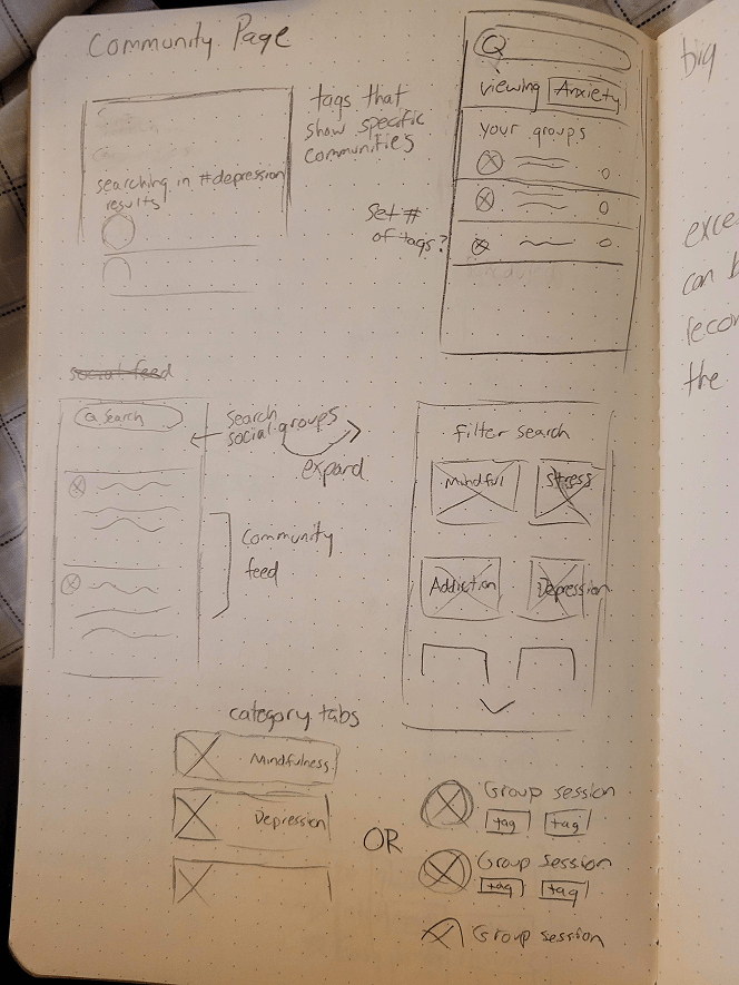
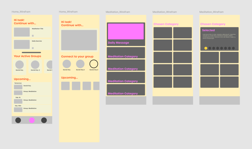
Wireframing
Sketches were the early phases, the importance of is that it took less time to sketch and write notes which I could review and knock out any problems. With higher fidelity versions coming after, I could decide what pages were important and visualize what components would need to be designed, eliminated or altered. High fidelity wireframes also allowed me to see the readability and accessibility of backgrounds to decide on styles.
Final Flows
Conclusion
This project taught me the importance of planning and keeping organized. It tested my skills on creating design systems with having a duplicate system just for dark mode. Wireframes quickened the workflow eliminating any guess work and allowed me to spend more time designing the buttons, icons, illustrations. I proudly made research backed decisions by creating a form and questions that I personally created to measure the user’s interest.
Explore the prototype yourself via Figma!