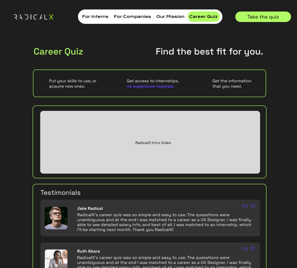
A Career Test by RadicalX
November 2022 – Certificate Program Project
UX Research, Team Collaboration, UX Design, UI Design, Web Design, Wireframing, Design Systems, Branding
Background
RadicalX (now known as Reality AI) was a smaller company focused on empowering and developing the skills of young minds with internships. This was a free course that allowed freshly graduated students to apply their skills and practice working on a team. Along with about eight other interns, we would take on roles of project manager, UX designer, UX researcher, UI designer, graphic designer, and more. We held communications through Slack channels and showed our work on Miro working in a scrum fashion over 4 weeks.
The Problem
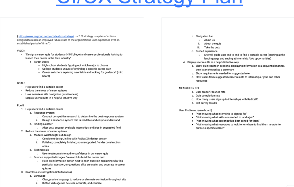
There is a shortage of internship opportunities and too many graduated students and other professionals seeking a new career. Students are graduating high school without direction and the tools to figure out what they want to do for a career. Other students are graduating college without the opportunity to get into the job field they studied for. Professionals want to switch fields and take a test for a job better suited to their current skills and personality. As a team for this internship, we could all relate to the goal of wanting to gain professional experience and develop skills. HireX would allow those seeking an internship to discover their dream job.
My Role
As a recent graduate from Temple, I took on the role of UX/UI Designer and Researcher. Performing tasks like competitor research, gathering data, making research-based design decisions on wireframes, and design system organization.
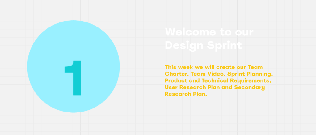
The Process
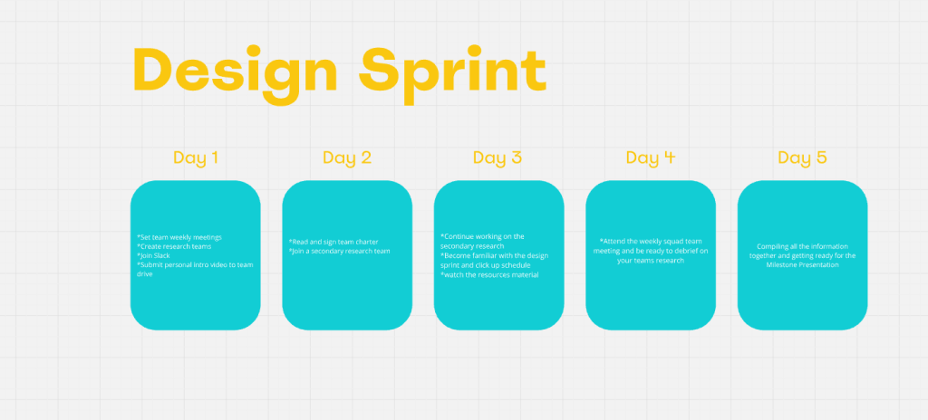
Organizing on Miro and Slack, we performed weekly sprints to plan:
– Sprint Week 1: Introductions, product naming, roles discussion, branding and logo
– Sprint Week 2: Organize user research and secondary research teams, compile competitive research for presentation on Miro, UX strategy, schedule to meet virtually twice a week.
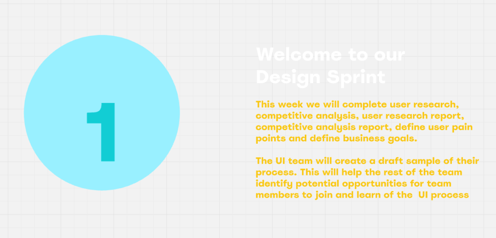
– Sprint Week 3: Complete user research, competitive analysis, define user pain points, define business goals
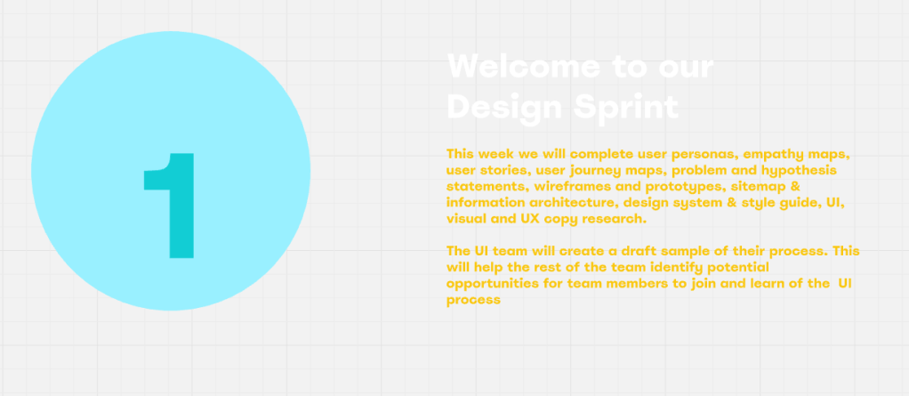
– Sprint Week 4: Create user personas, empathy maps, user journey, problem statements, hypothesis statements, site maps, and design systems based on findings of previous week.
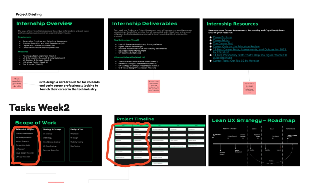
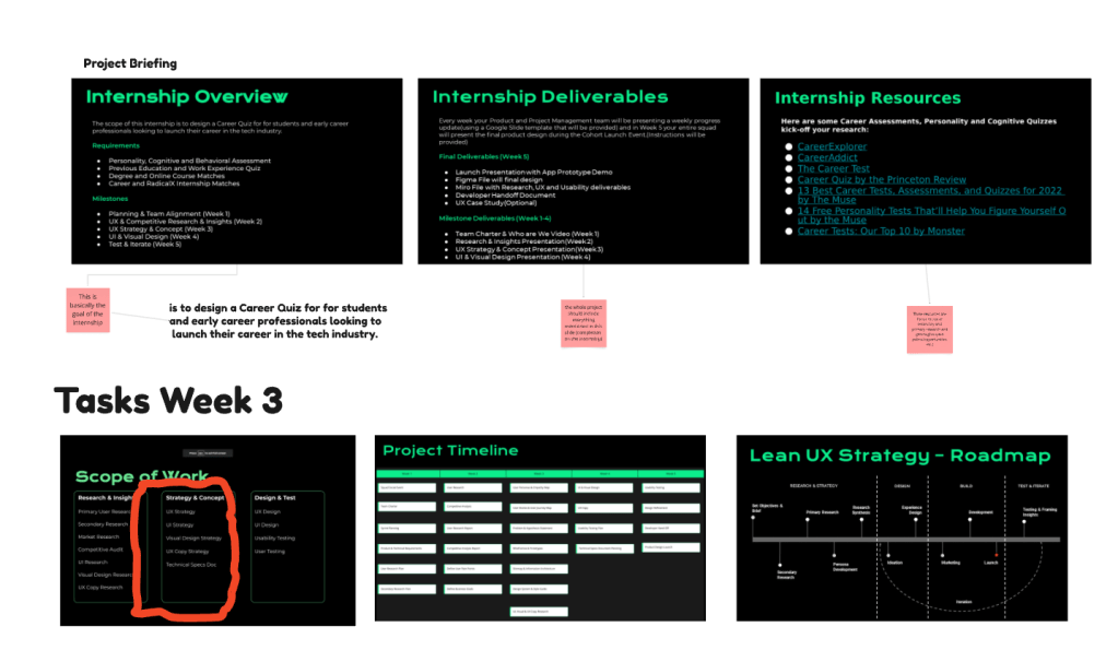
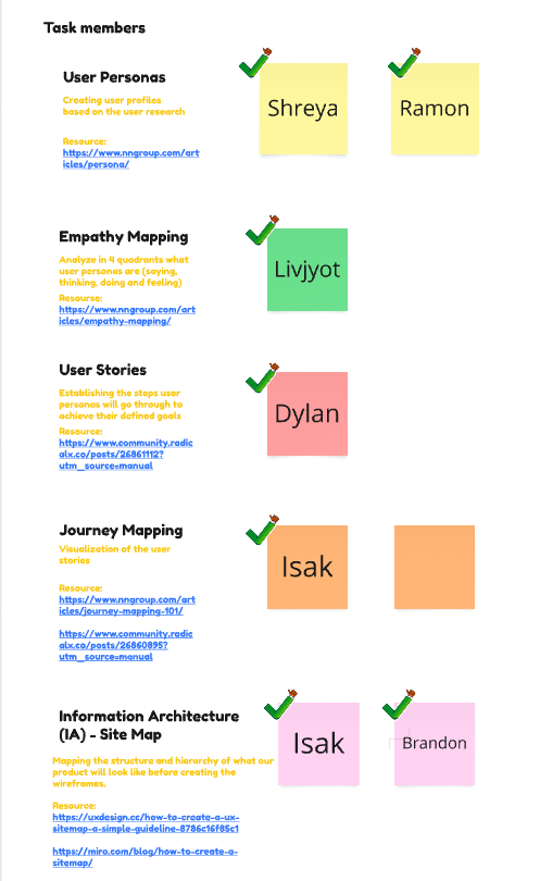
Key deliverables were mapped on a roadmap into three phases: research strategy, design, building and testing/iteration. Each week we set the scope of work that needed to be addressed. The four weeks of the project timeline were kept track of as shown in the images above. I volunteered to focus on the Journey Mapping and Information Architecture, showing and linking my sources for my research findings. I searched forums of job listing sites, searching for other people’s experiences. Initial questions were listed to
Research
User Research and Secondary
Early planning began with defining the user problems, target users, and a brainstorm of questions to understand users’ pain points. This primary research was planned by the defining who they are, what they want, where are they currently looking for their solution, why was it their solution and how did that produce results. Quantitative research was conducted via surveys on google forums. Qualitative research was conducted via user interviews which various team members interviewed someone searching for job opportunities. We took that data, summarized it and used it later in our problem statement and user personas.
Alongside, secondary research was searched via articles about users searching for career paths. A mind map was created to paste the thoughts and organize them during this phase. UX interviews, articles, and users posting online were parts of this mind map. From this research we asked, ‘How might we design a career quiz for students and professionals looking to launch their career?’.
Competitive Analysis Summary
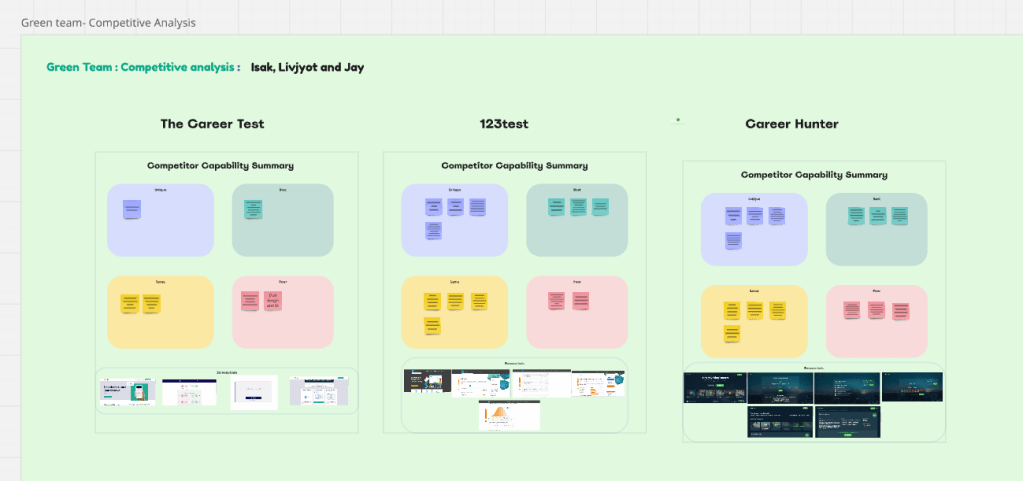
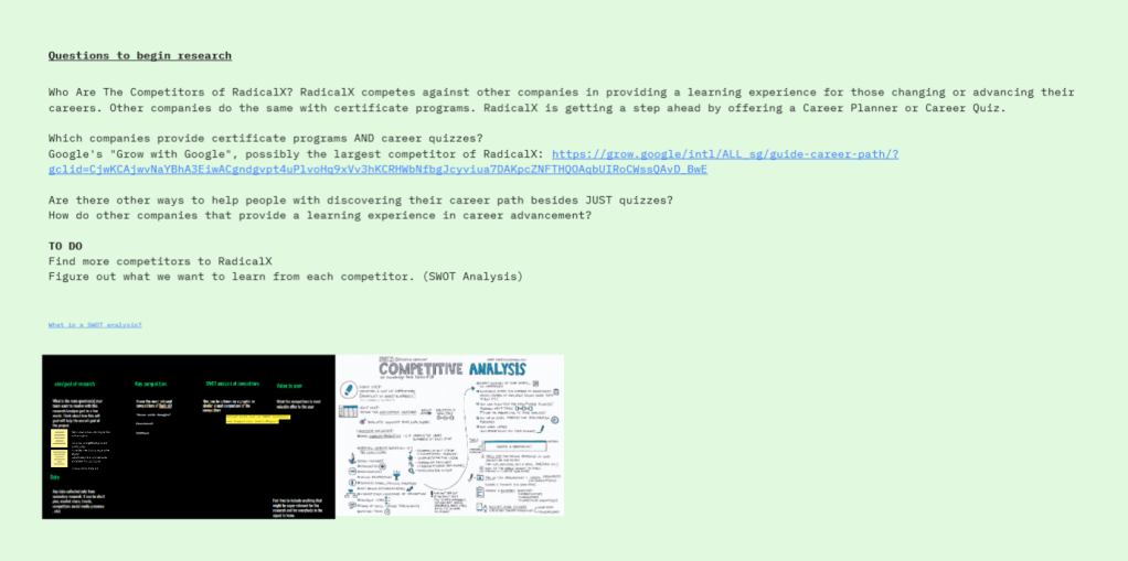
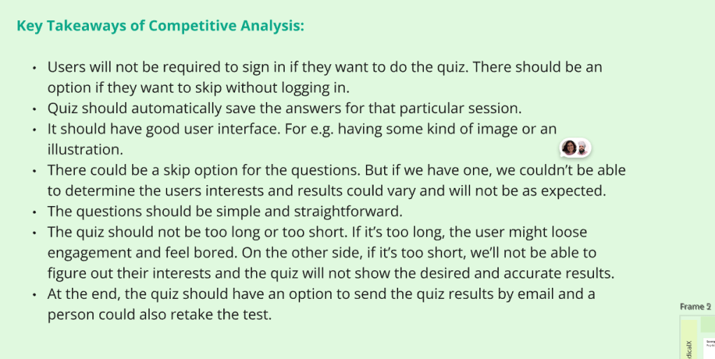
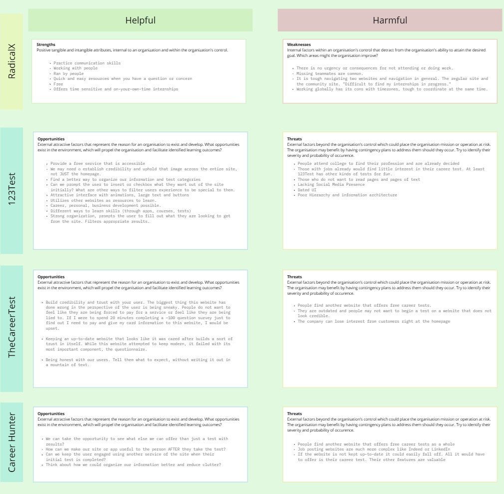
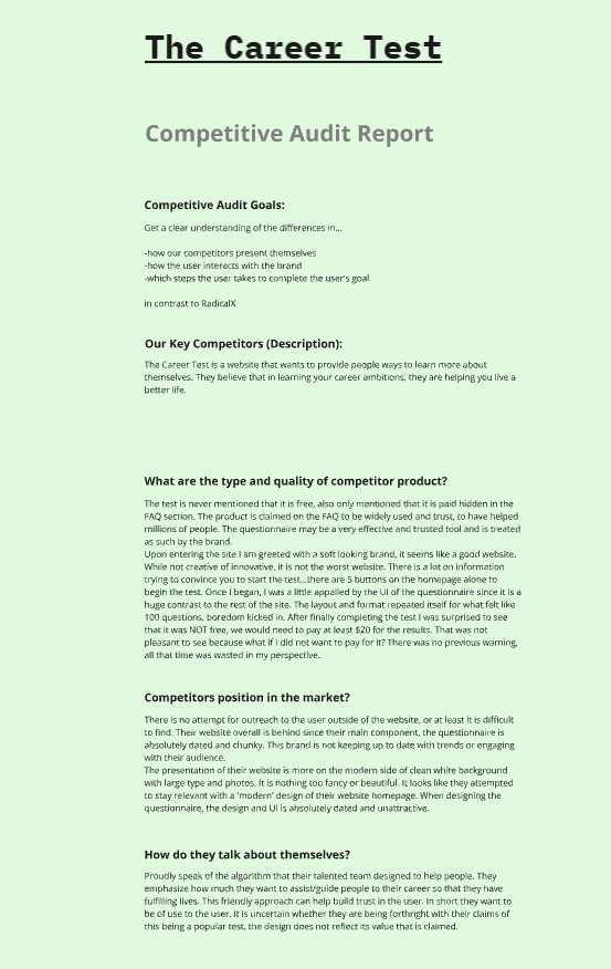
The first two weeks was to split as teams and focus on one method of research. Our team’s goal was to find out how other sites presented themselves as far as copy, style, types of questions, amount, paid/free, steps taken to complete, and more. We found other career-like websites with quizzes: Test123, Career Hunter and The Career Test.
The Career Test:
Weakness
– Had a lot of information fed to the user at once, not stated that it’s free or paid.
– Long questionnaire of about 100 questions.
– The end of the test had a fee to get your results which may be a deterrent and turned away users.
– The experience was not cohesive, looked like the questionnaire was dated compared to the home page of the website, may lead to lack of trust in the brand.
– Repetitive questions and the same format of choosing multiple choice, lead to fatigue.
Opportunity
– Honesty about what to expect. Short and concisely. Prevent fatigue.
– Maintain a design system to keep the website cohesive in design and language.
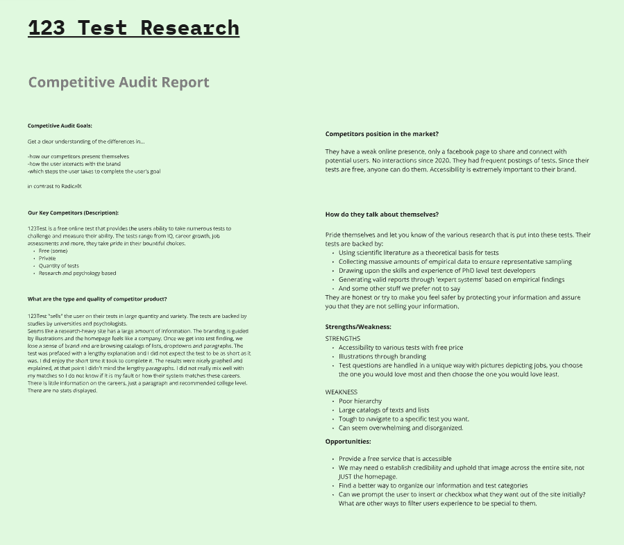
123 Test:
Weakness
– Lengthy mountains of text
– Tough navigation if you have an idea of what you like already
– Overwhelming
Strengths
– Accessibility and various tests, free
– Illustrations and beautiful branding
– Tests are handled with imagery, different style of questions by ranking which you loved most and which you loved least
– Established credibility with science-backed research
Opportunity
– Provide a free accessible service like this site.
– Establish credibility across site
– Good copywriting to shorten information flow
– Ways to filter down information to a specific audience
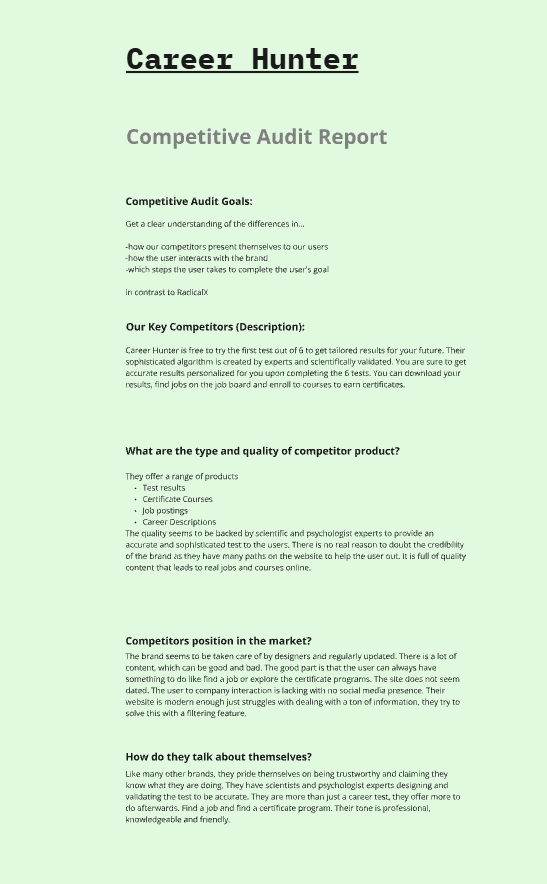
Career Hunter:
Weakness
– Free first test out of required 6
– Large amount of information, tough to digest at once
Strengths
– Provides a job board based on your results
– Offers multiple products like Certificate courses, jobs posts, descriptions of jobs
– Established credibility with copy describing scientific-backed questions
Opportunity
– Find use after the user finishes the test via other products, suggestions
UI Research
Similar to the competitive research, we organized our findings into five categories: Strengths, Weaknesses, Pain points, Improvements, and Summary of UI in a chart. The UI team took a deeper dive focusing on the interface, style, and branding. What works well and makes you intuitively trust a website, why does a website make a confident decision and how does the UI reflect that? (ex: blurred images behind a paywall). I paid special attention to studying the UI findings as I intended to work on the design systems and wireframing.
User Persona and their development.
The importance of creating a user story was to define the goals and needs of the end user for each situation. The benefits are to keep a clear and consistent goal throughout the project, making processes more efficient and saving time. Below are the problems and hypotheses summarized from the user stories.
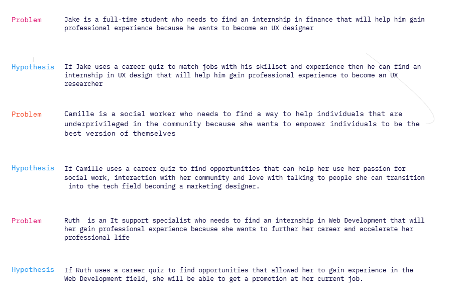
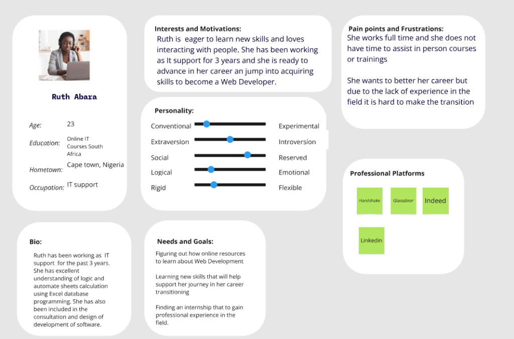
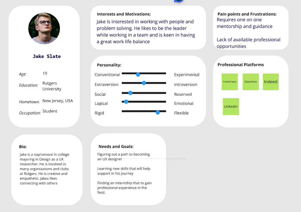
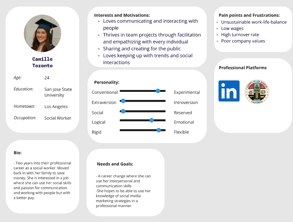
These three user personas were created and expanded on to gain insight on pain points, interests, and personify the user stories we created initially. We pulled in the research from the first few weeks to aid in creating these personas.
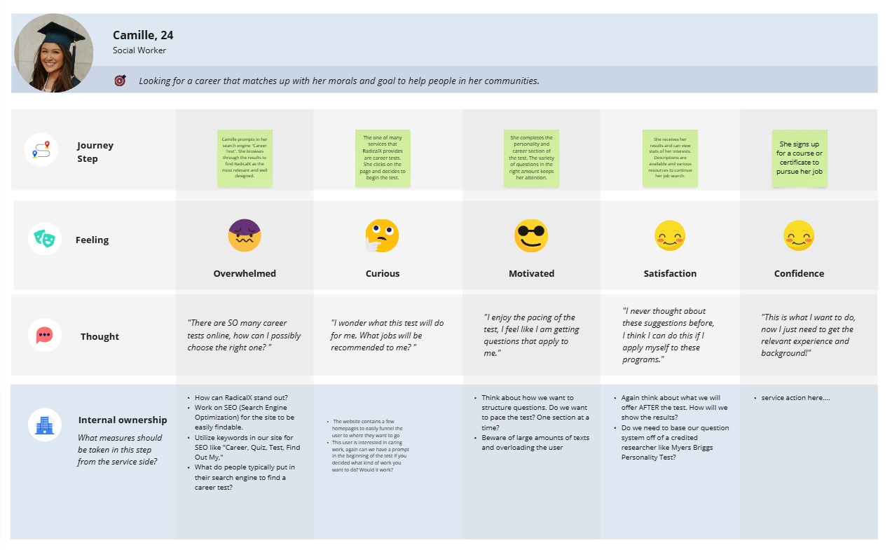
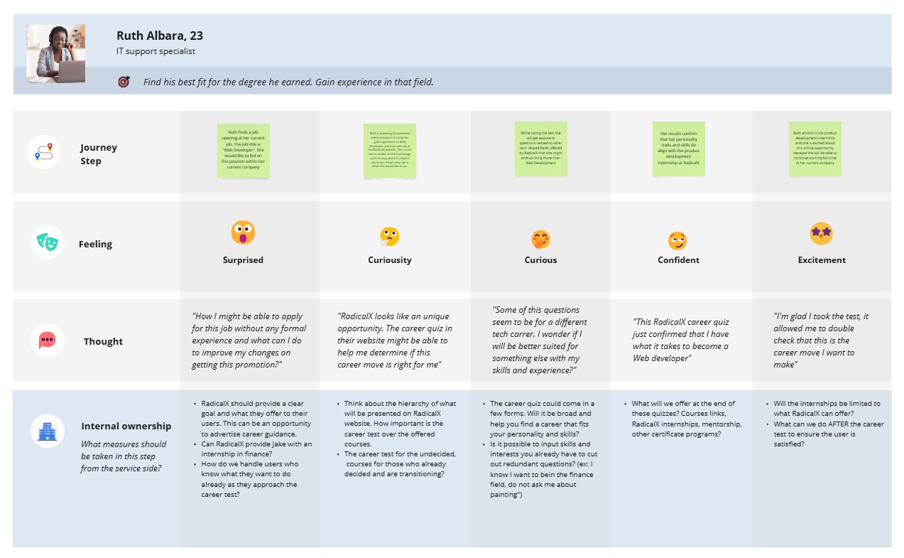
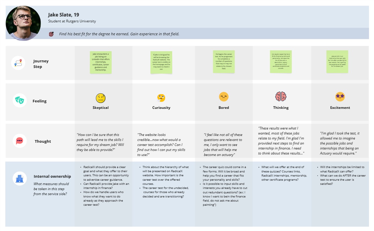
The importance of the journey map was to imagine the path and feelings of each user. Possibly defining opportunities at each step and frustrations. How can we accelerate customer engagement? What parts of the business do they engage in? As I was creating the journey map, it helped me visualize elements and key components I would need to include in the design system. This process would also help me with the low fidelity wireframes, this certain path for this user persona isn’t best for every user. How can I funnel their experience as to have no distractions?
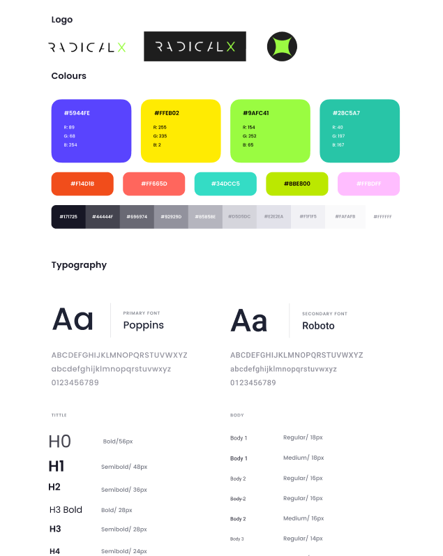
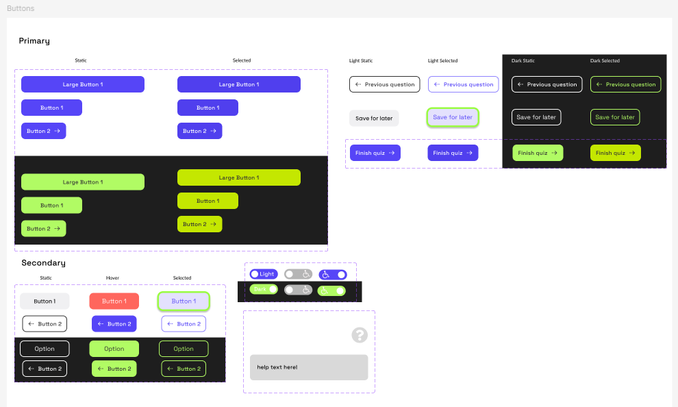
Design System
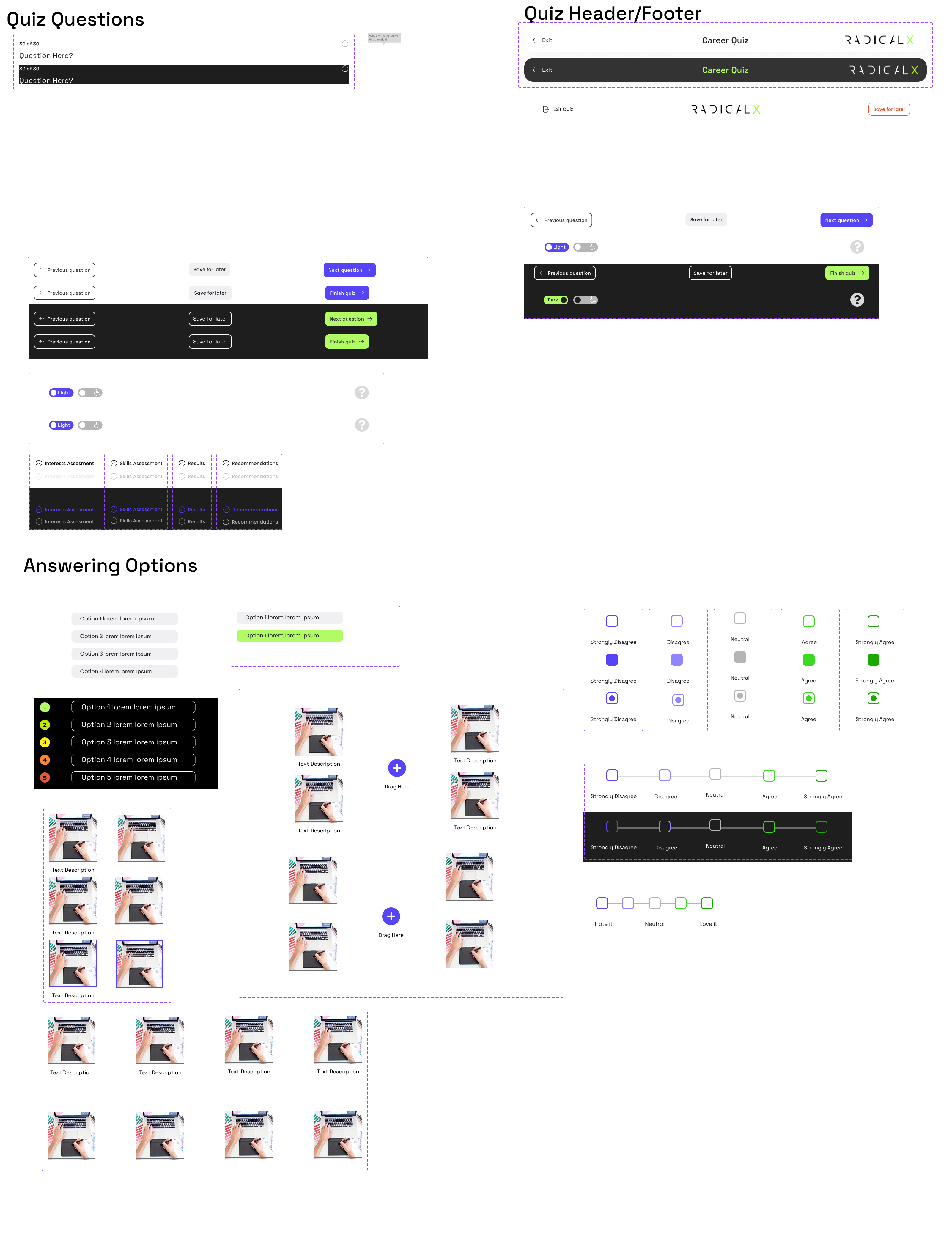
Wireframes
Low Fidelity
A large amount of low fidelity wireframes was created and mapped besides each other following the main flow of completing the quiz. Alongside the low fidelity wire frames, we were building the early design system drafts iterating and improving the UI. We got an idea of what size we wanted components and buttons to be, we pasted the components to medium fidelity wireframes and referencing the journey maps we proceeded to polish the experience.
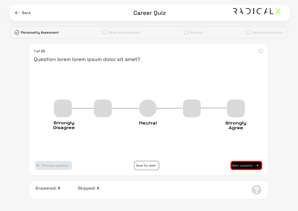
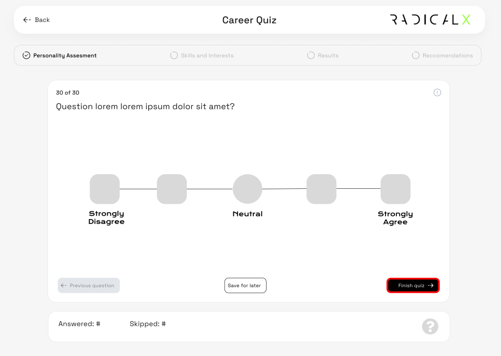
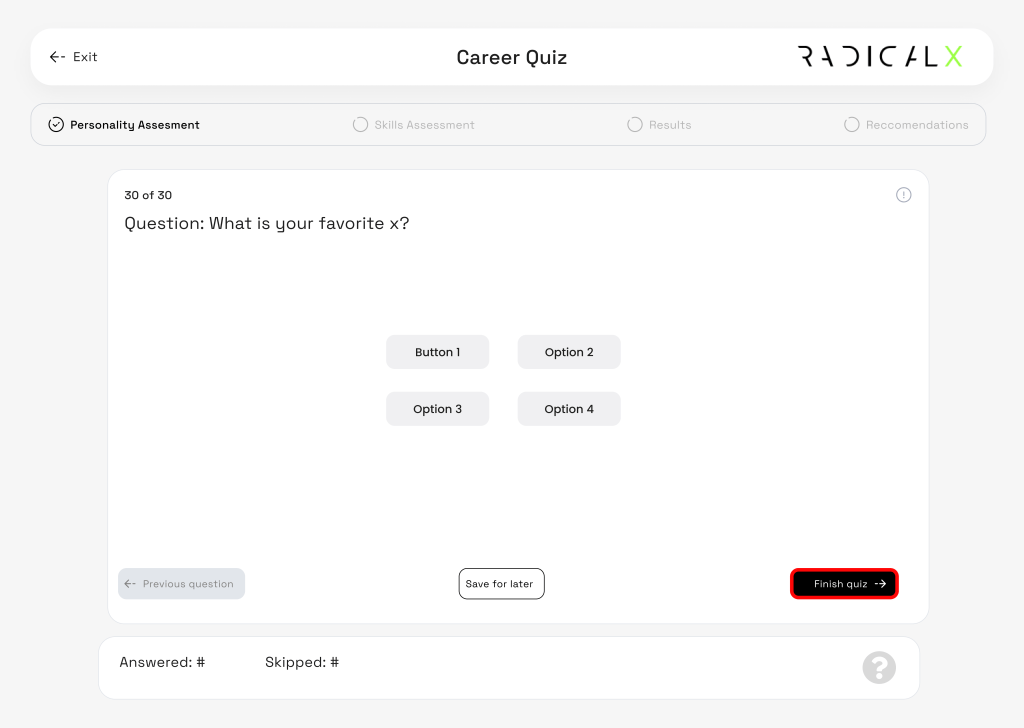
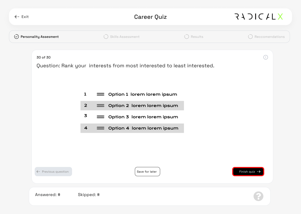
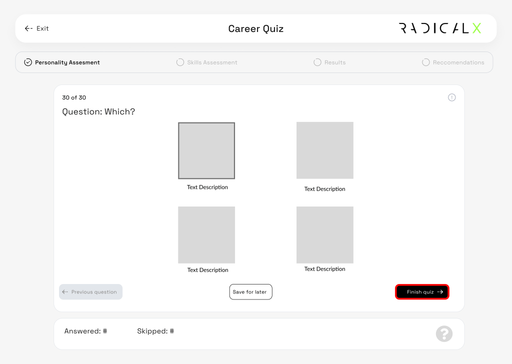
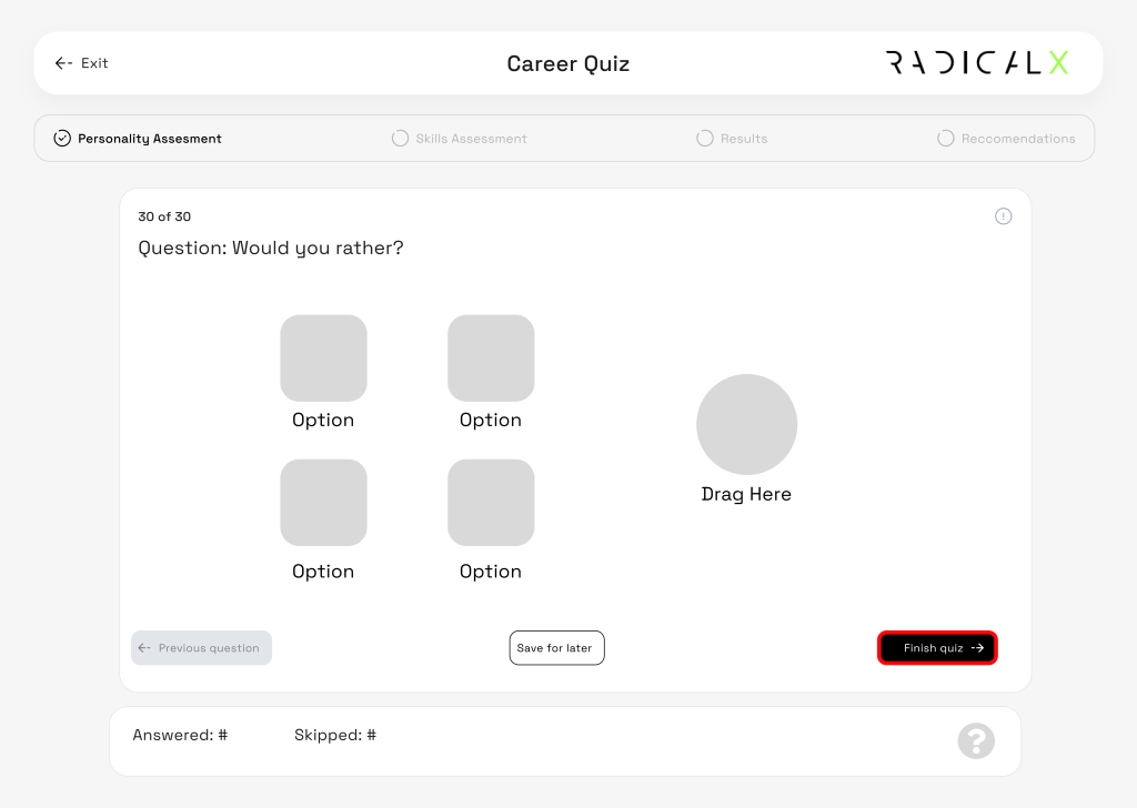
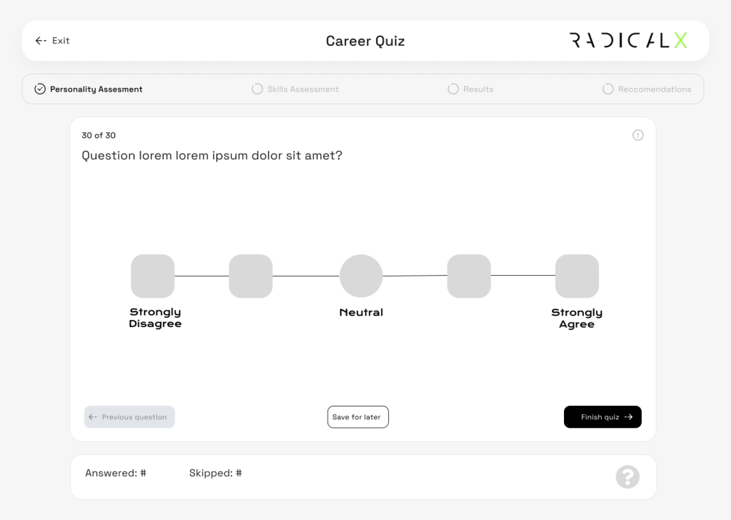
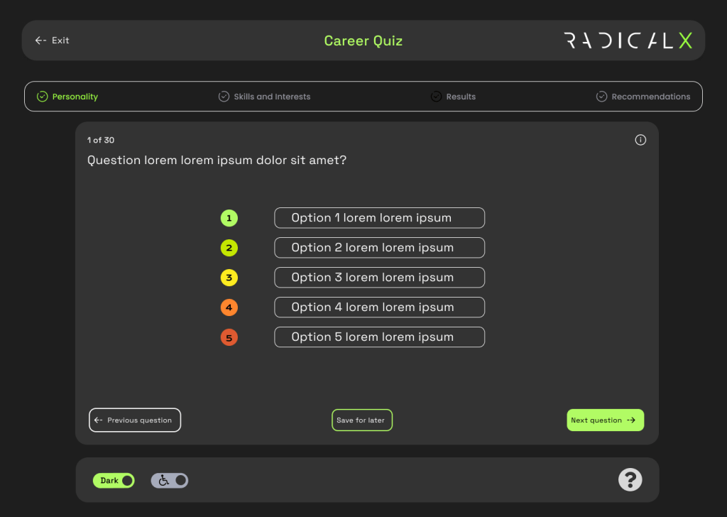
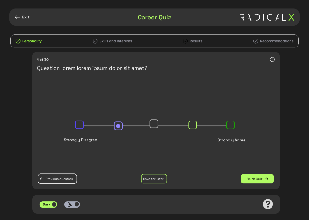
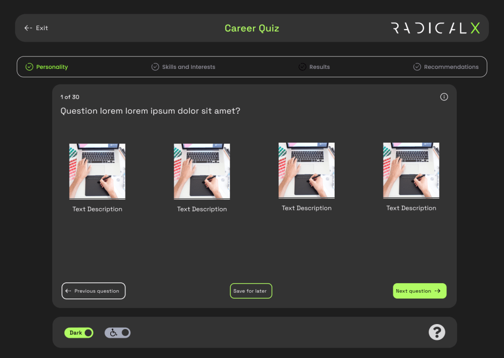
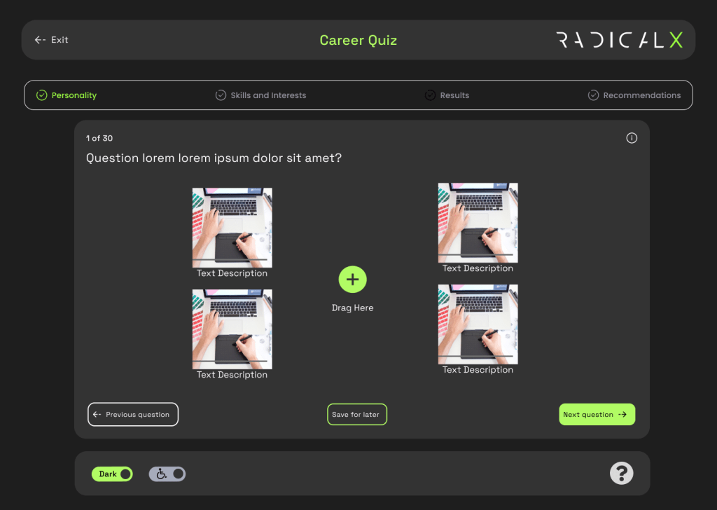
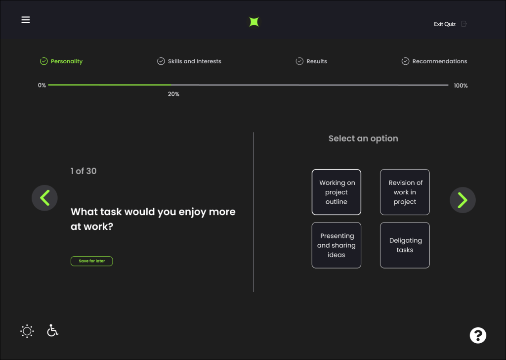
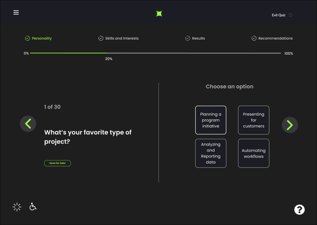
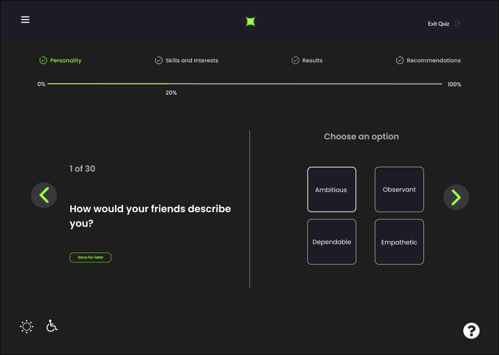
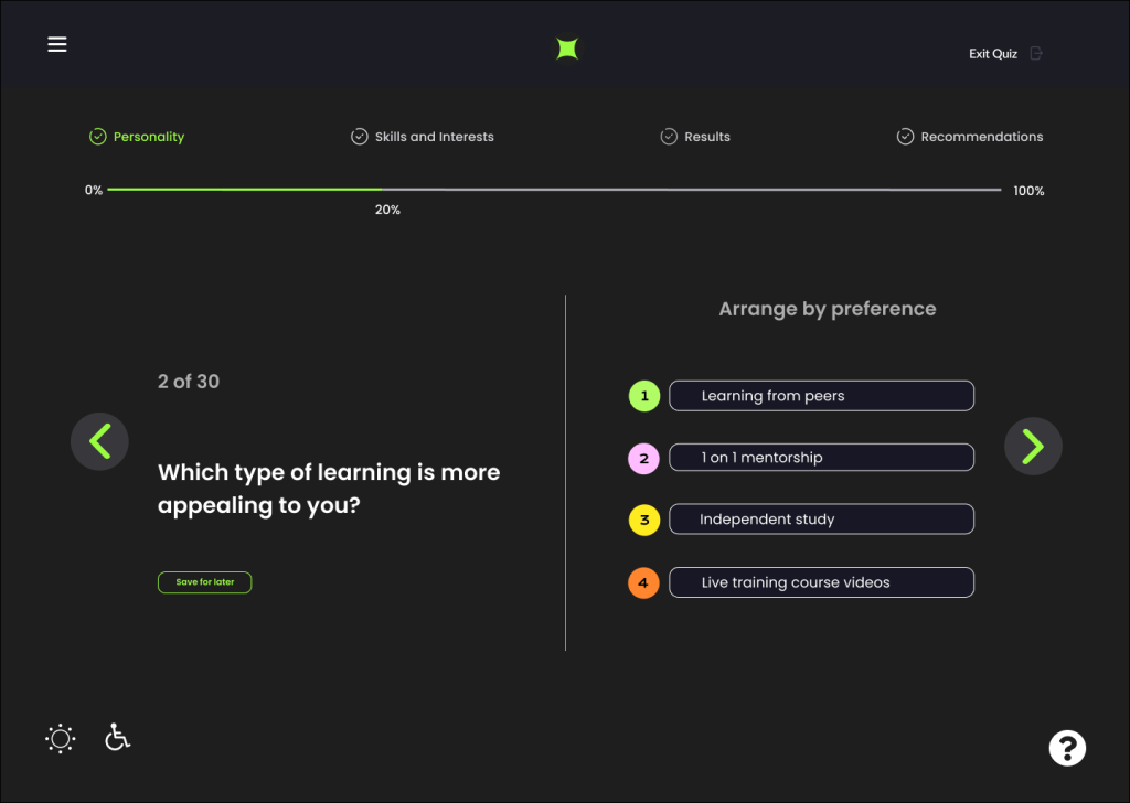
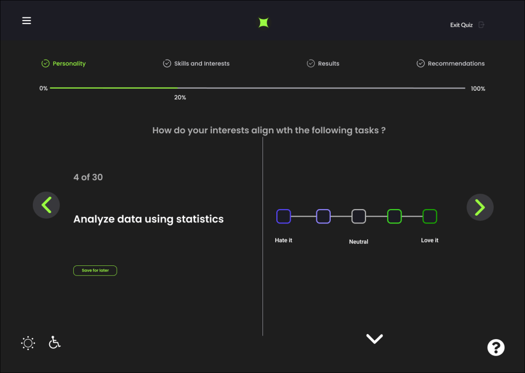
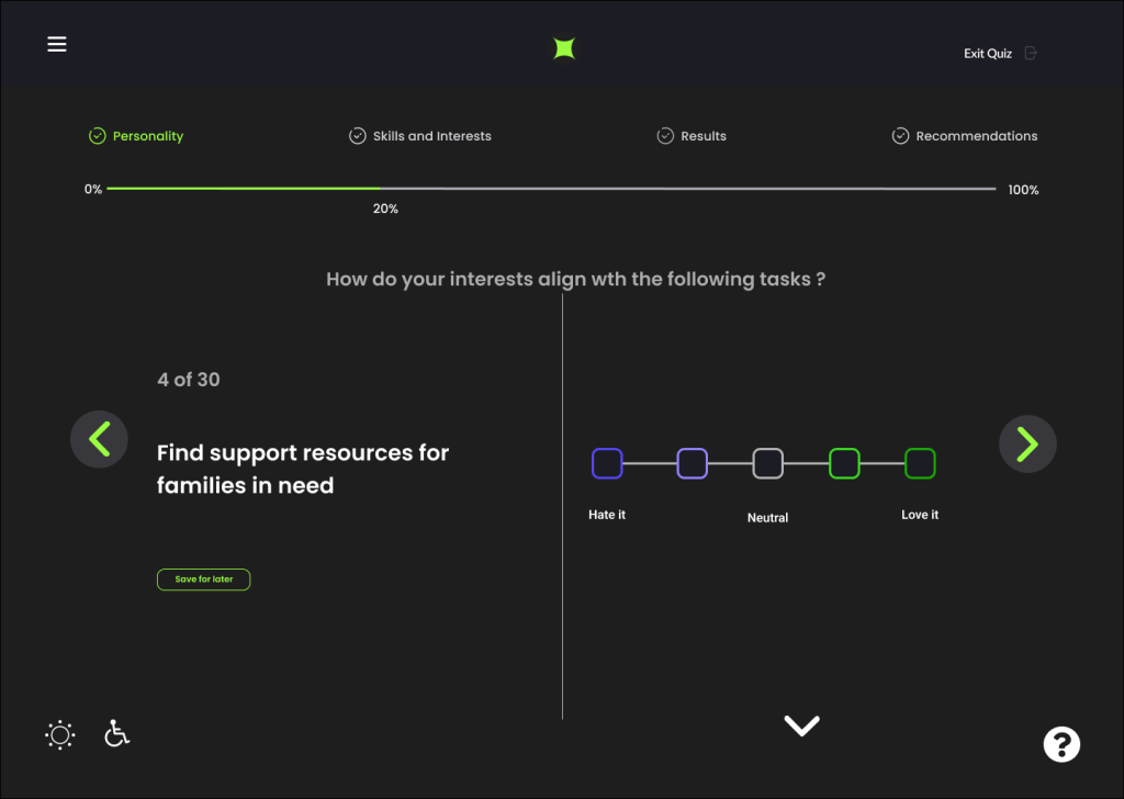
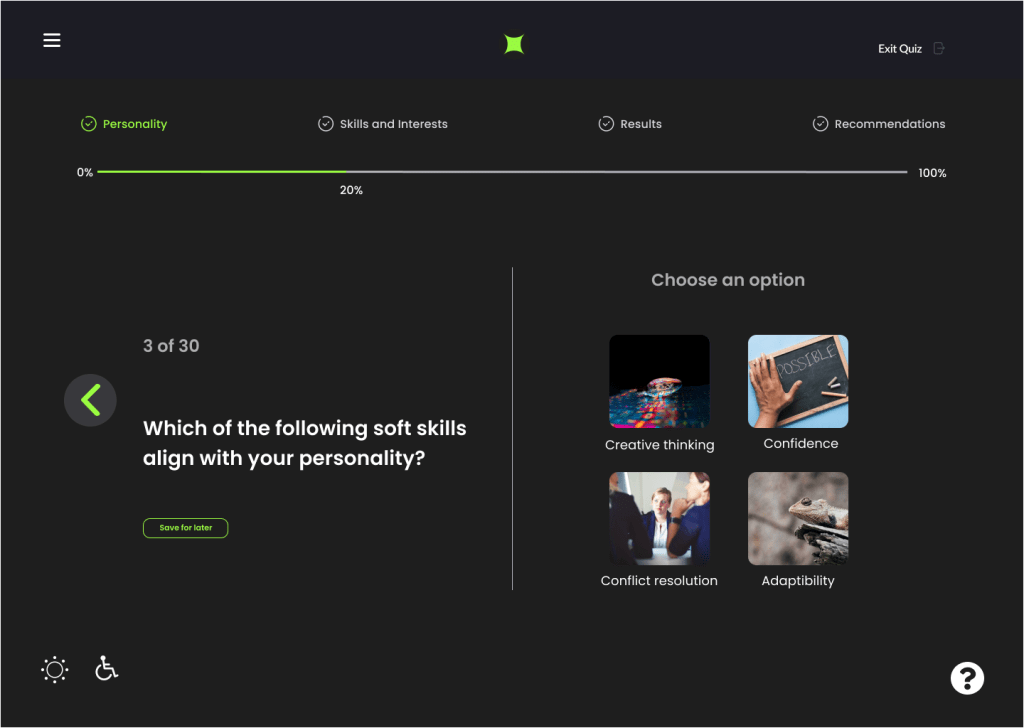
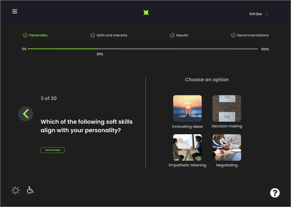
We surmised from our research that to make the tests more interesting we needed different ways to ask questions. This included using a scale, ordered lists, dragging and dropping images and more.

High Fidelity
The process of transferring from low to higher fidelity screens required intensive discussion. Holding many versions of the low fidelity screens, we utilized inspiration from the strongest characteristics form our competitive analysis research, the best of our low/mid fidelity wireframes, and which best worked with our user journeys and user personas.
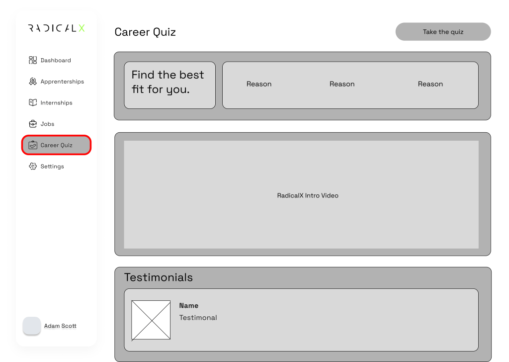
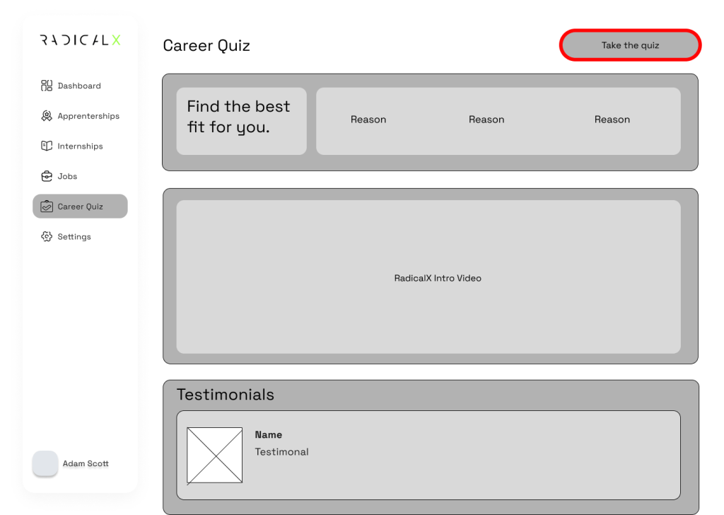
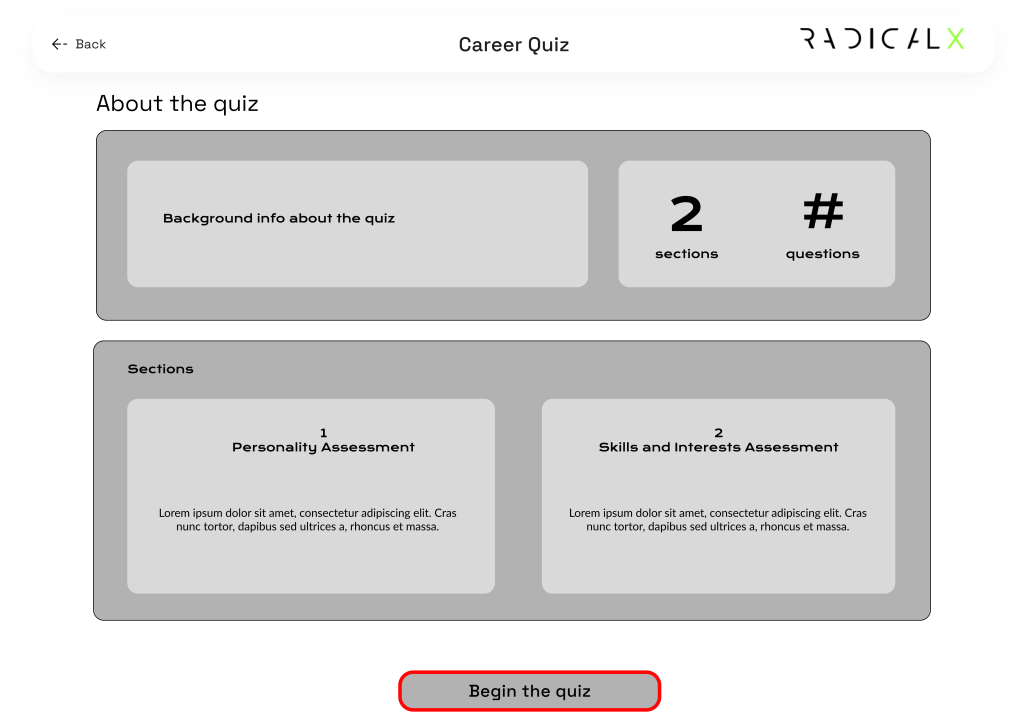
Final Pages
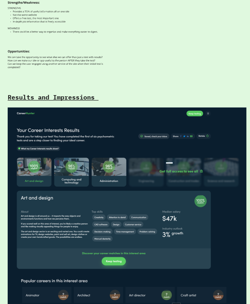
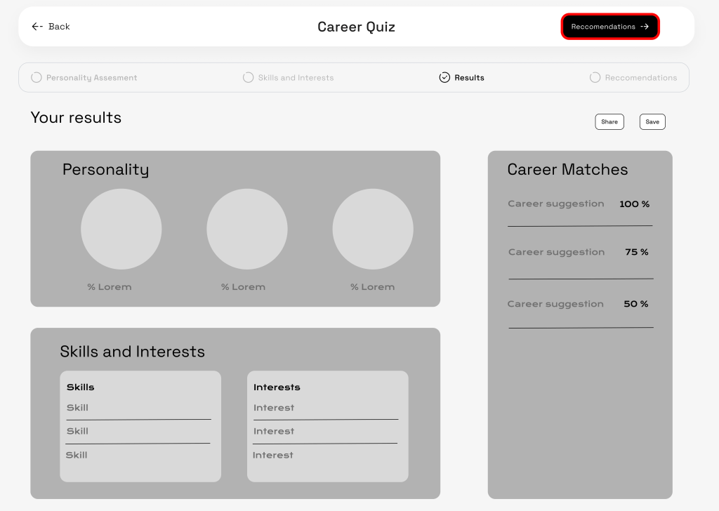
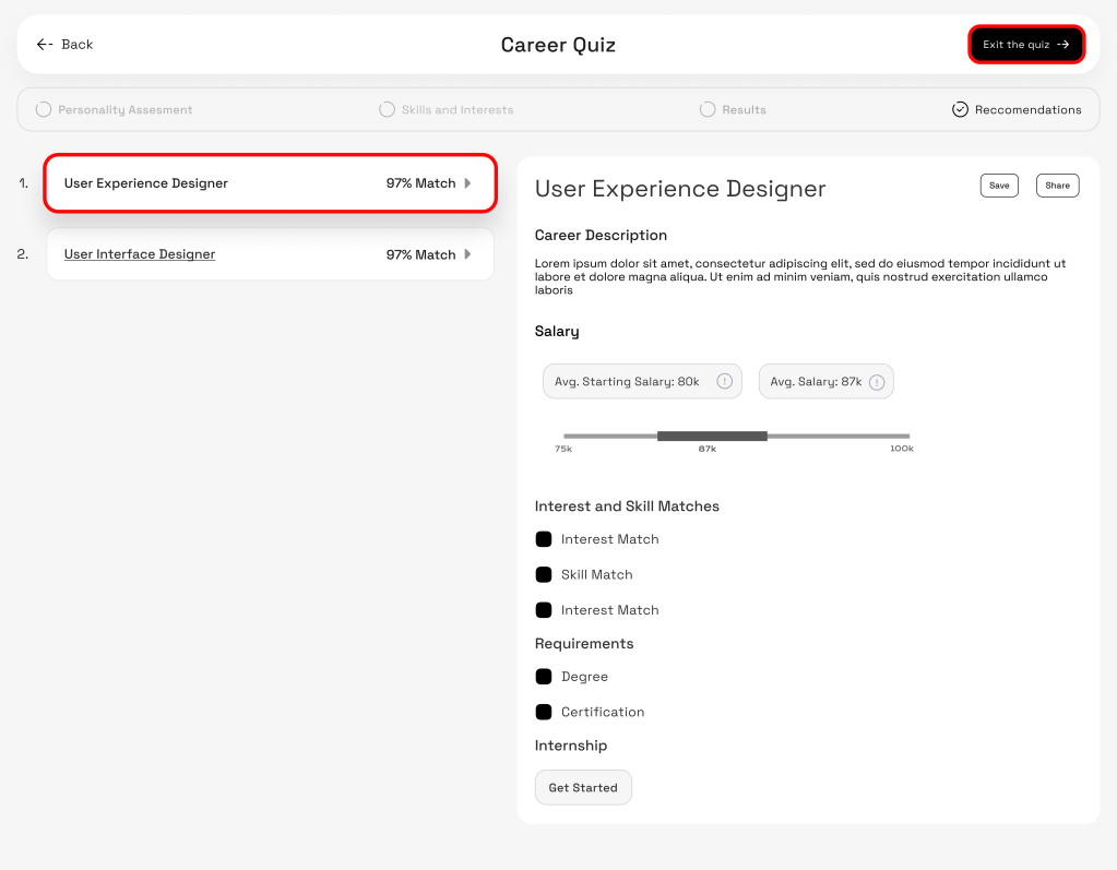
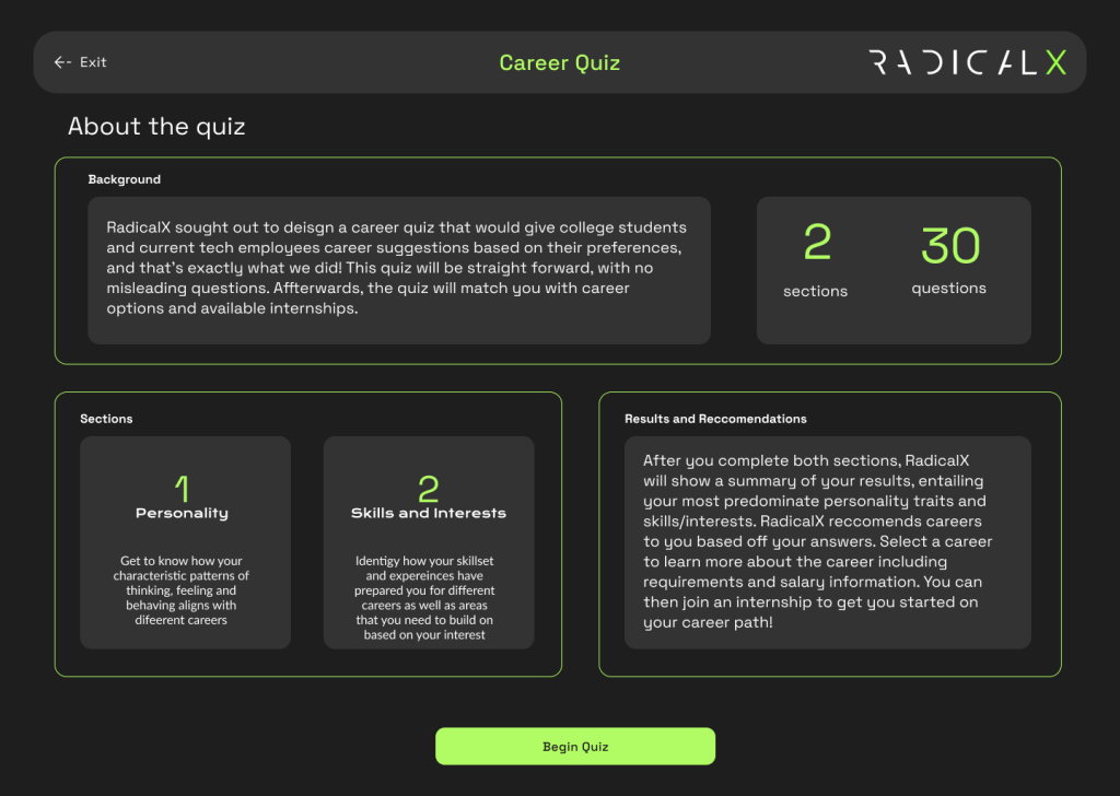
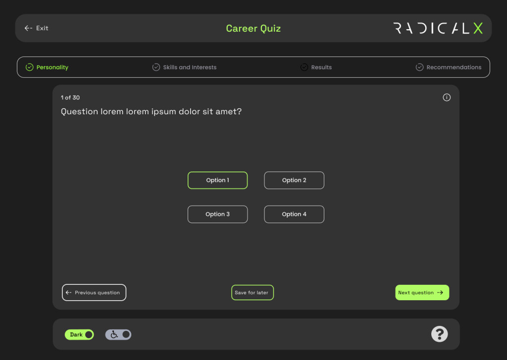
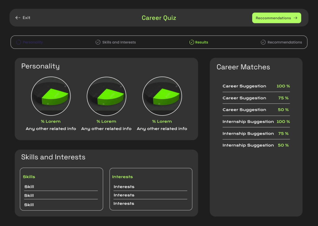
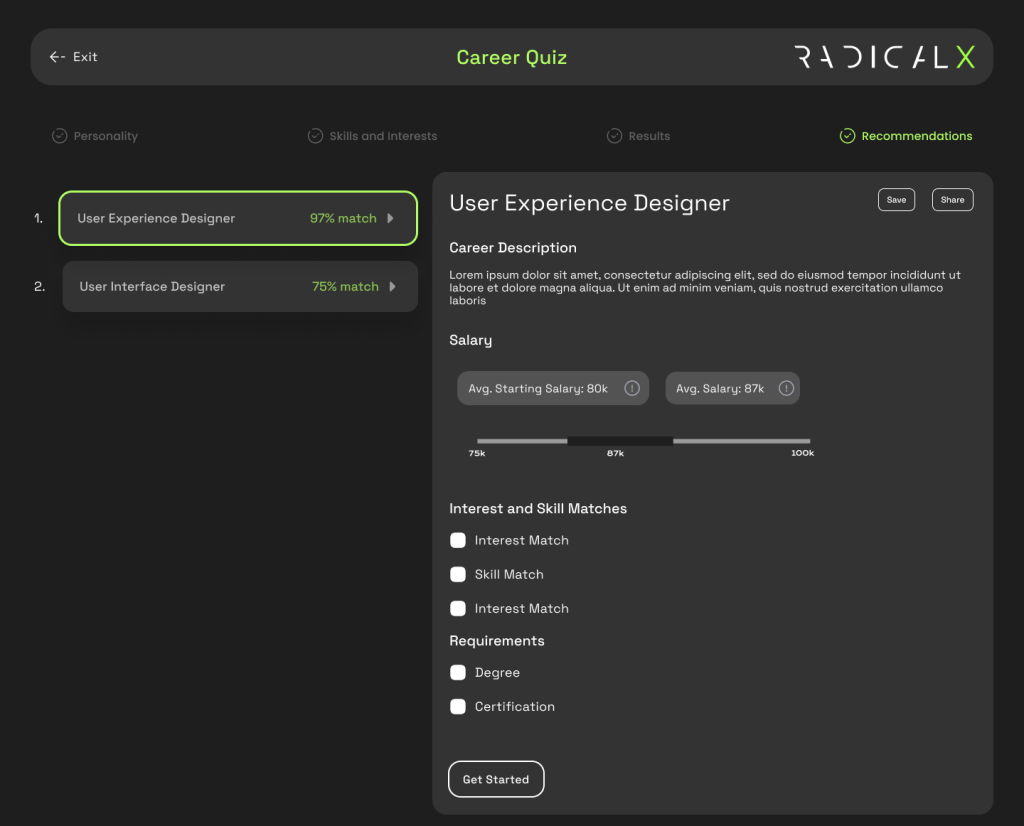
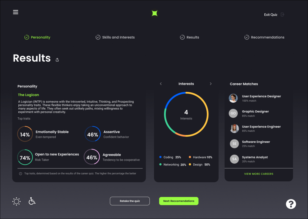
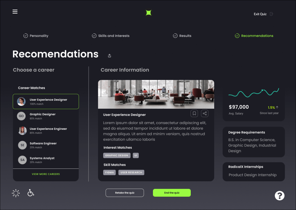
We held onto our goal of keeping a career test that holds different ways to ask questions via multiple choice through text, image, arranging the most suitable choice, utilizing scales. This is the final flow for a user seeking a career test to help define their career. The results are displayed based on the questions answered, you get statistics with a visually appealing pie chart. Career matches are explored based on your results with descriptions organized by skills and interest. Degrees, salary, and RadicalX internships are suggested on the right.
The challenges of this program were coordinating with others at different time zones, it would be difficult to get on a video call at the same time or we had to handle not getting immediate replies. Ways to work around this was utilizing comment tools on Figma and Miro as much as we could and stick to the plans defined at the start of each week for our scrum meeting. Communication is always key when resolving any disagreements or when providing a better idea.
